Illinois Lottery App
The Illinois Lottery offers a wide range of online games for consumers 18 years old and over. As driving digital game play has become a growing priority for the business, I saw an opportunity to refresh the Illinois Lottery app so that it is easier to use for both casual ticket checkers and frequent gamers alike.
Initial observations
The current app home screen is extremely busy, lacks hierarchy with over 10 different sections, and makes it difficult for players to make a decision on what to click.
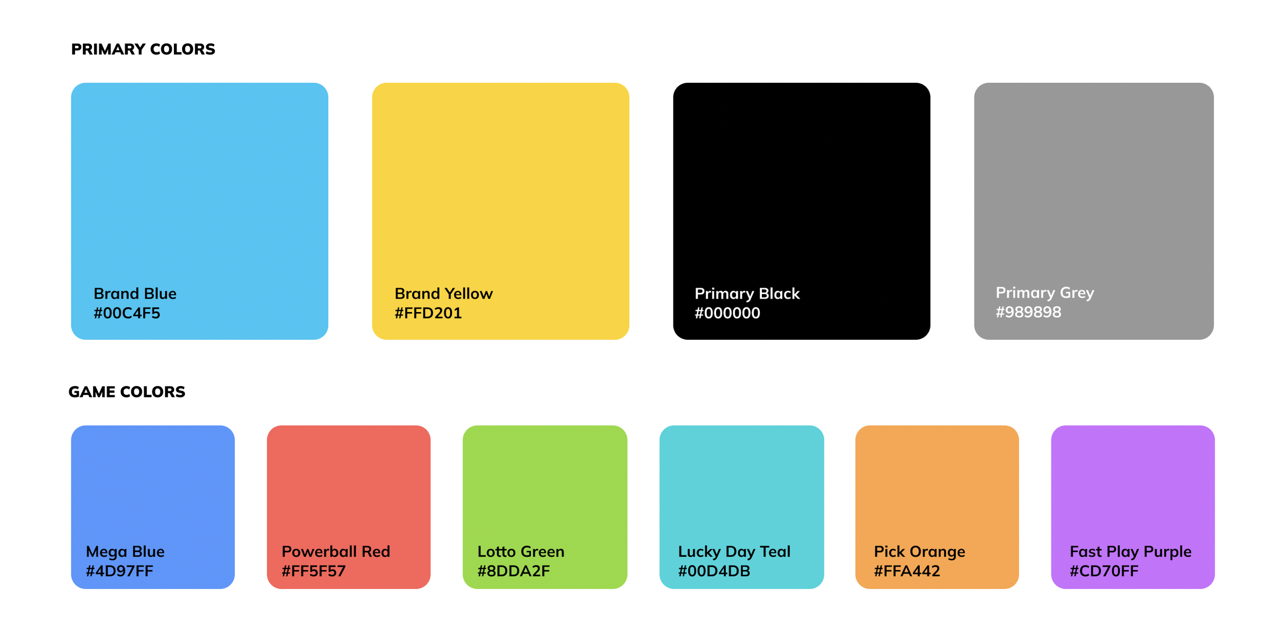
While the Illinois Lottery has a designated color palette, the colors did not meet ADA compliance for online use. My first task was selecting colors that stayed true to the brand but also had optimal contrast.
Existing website typography was outdated, so to match the energy of the brand, I selected new typefaces. By selecting a heavier weight H1, we are able to quickly distinguish major sections from one another. To continue to allude to the playfulness of the brand and app experience, I chose Gotham Rounded for body copy as it felt the most friendly (without being too childlike).
In order to further support the app refresh, I expanded the icon library with easy to read icons for quicker digests and identified which icons are standard, utilitarian icons and which are supporting any inspirational purchases or actions.
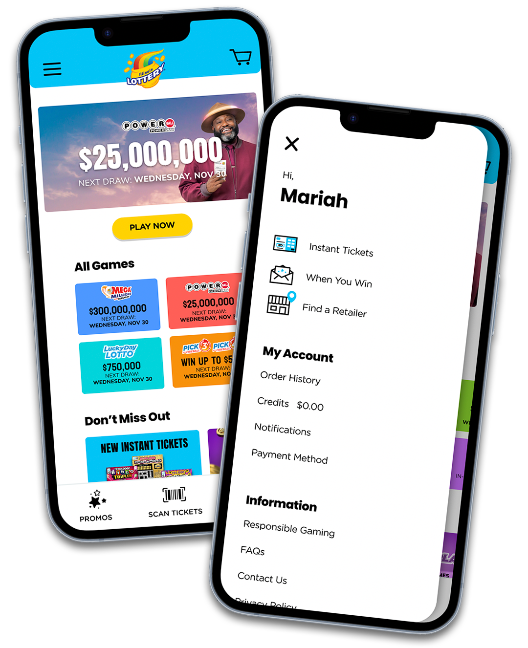
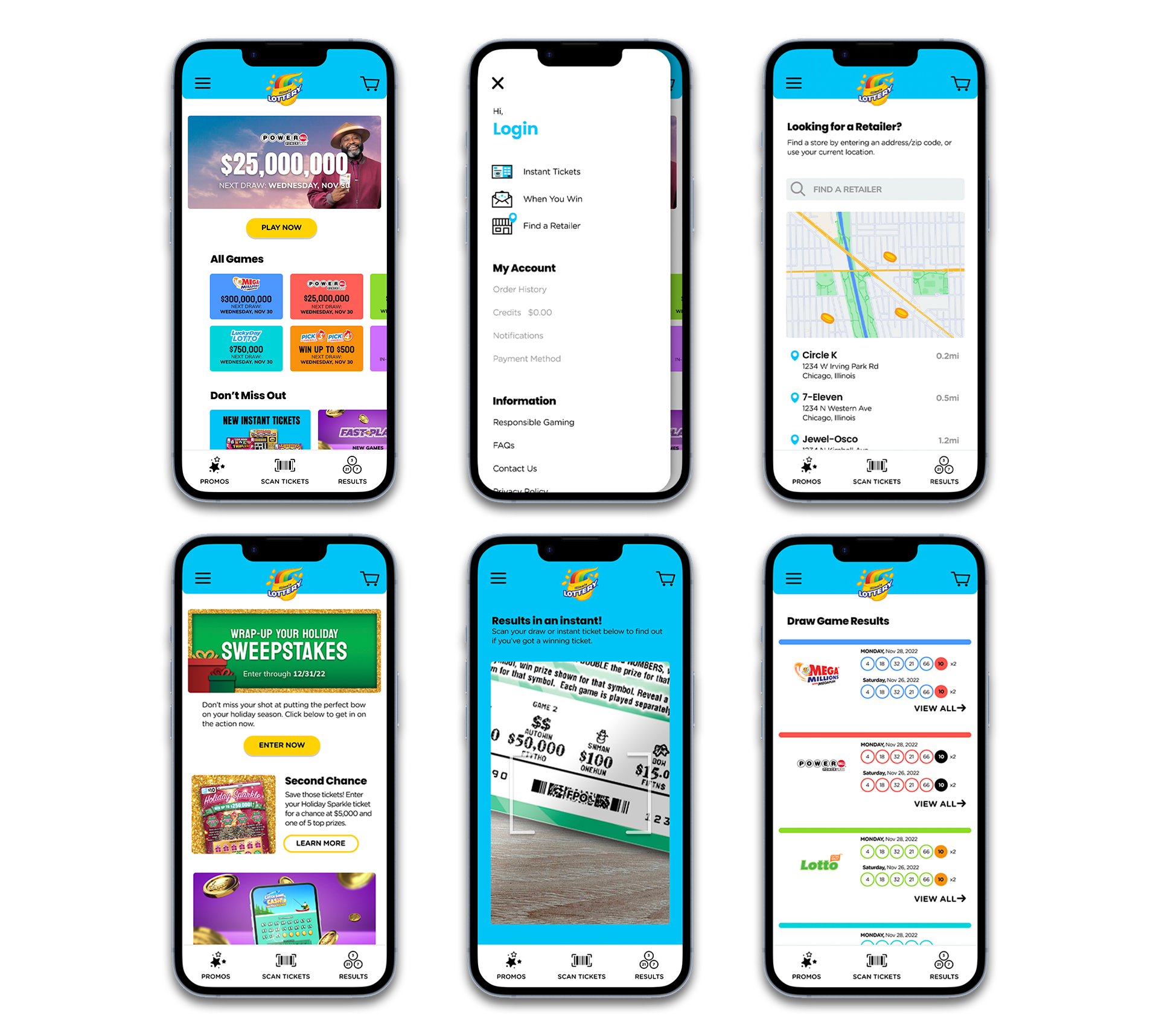
The home screen was cut down from 11 to 3 major sections, saving users a scroll workout and creating a clear and easy read for them to digest instead.
Since having an account is not necessary to utilize the app, I was able to simplify the footer options by moving Account and More within the hamburger menu. This menu features some of the iconography for quick reads, breaks out their account information at a glance if they are signed in, and also houses all the fun FAQs, Terms and Conditions, and additional legal under the Information component, further helping maintain a clean home screen.
If you’re in the app, you’re here for fun! Incorporating micro-animations throughout the mobile experience was key to continue that feeling of excitement and delight.


